Top 10 Web Design Trends in 2024 You Should Check Out
Andy Gibson
Just like any industry, new web design trends emerge every year that replace the previous ones.
Trends are supposed to come and go because the human mind doesn’t like the same experience for long. However, web design trends always revolve around one thing – making the interface as visually aesthetic and user-friendly as possible.
This year is no different. Let’s have a look at the top web design trends in 2024.
If you are launching a new website or revamping an old one, this blog will help you find the best website design trends for your project.
Top Web Design Trends in 2024
AI-Generated Content & Imagery
It should come as no surprise that AI is predicted to become a multi-billion-dollar industry by 2025 and web design won’t stay unaffected by it.
AI can change every element of a website: functionality, appearance, User Experience (UX), interaction, accessibility, and even marketing aspects. Designers and copywriters are shifting towards AI-based tools (like ChatGTP and Adobe Sensei).
But wait! Does that mean AI will replace designers and content writers? The short answer is NO. What AI will do is streamline the creation process for efficiency.
In 2023, we saw how AI impacted some key aspects of web design. For instance, chatbots have become a norm in almost every e-commerce website. You can expect this trend to continue in 2024 and beyond.
You can use AI chatbots in your business to improve customer experience by allowing clients to instant access certain information about your product or service. This can be easily done by pre-programming conversational pathways.
Another change that will be observed is the increased use of AI-generated images (using tools like Midjourney and DALL-E 2) on the web. Designers may use simple prompts to generate a rough image and then tweak it as needed – saving hours of effort so you can expect to see more of this in website designs of 2024.
Companies want to show that they are forward-thinking and have modern practices. With this theory in mind, you can be sure that most companies will try to adopt AI in their web design and copywriting practices.
However, on the flip side of the coin, expect to see some pushback from people who might have concerns regarding the use of AI in web design but the truth be told – AI is here to stay.
Use of Negative Space
Negative space (aka White Space) is the area of the web design layout that is left empty. It’s used to leave space for content so it looks clean and uncluttered.
A website that’s full of text appears cluttered while it might seem outdated with little or no negative space.
A clean design is a soothing experience as the users don’t feel overloaded with information and the readability of the content is improved since they get highlighted with much more breathing room.
Modern web design trends are heading towards minimalism with purposeful use of negative space that allows users’ eyes to rest from one element to the next. When elements are not spaced properly the human eyes tend to view them as one single element (leading to confusion).
Just take a look at how fresh the image above looks and how it makes you feel like exploring more of the site (leading to a better user experience and hence a higher purchase rate).
Storytelling Through Interactivity & Motion
In this age of technological revolution (such as AI) web designers will employ design techniques that make websites feel high-tech and futuristic. Over time, more businesses will realize the value of a “tech-friendly” web presence and 2024 will be no different.
Websites will use interactive website elements to tell you a story about themselves and their products or services. Users spend much more time on websites with interactive features – it makes them feel like the future is now.
Storytelling can be used to keep users engaged and when combined with interactive web elements (like scrolling, playful cursors, 3D animation, motion, and dynamic graphics) can be a very powerful tool. Research by Stanford Business School confirms that a story is 22 times more likely to be remembered than just facts alone.
Our brains are designed to understand and remember stories that paint a mental picture rather than logic or facts. Use the interactive storytelling method to take your users on a journey that moves them emotionally – remember that we make purchases through emotions and then justify our purchases through logic.
Refer to the unique method of interactive storytelling in the GIF above; they let the users choose their storyline so that they feel more immersed and emotionally invested in their story.
For the sake of a good UX, just don’t overdo it. But since this is an emerging trend – don’t be afraid to experiment and pioneer new interactive storytelling techniques in your web design.
However, do keep in mind that interactive UX design like this can be costly and time-consuming but as technology evolves, the cost and time for development will cut down. That is why it is about time to ride this trend into the future of web design.
Hero Section
Hero sections refer to the banners below the menu bar on top and it is the first thing that users focus on when they land on your website.
The whole internet is craving users’ attention and time and as a result hero sections in 2024 only include important information.
We have looked into hero section trends in 2024 and listed those that are likely to keep on trending beyond just this year.
Full-width design
This usually covers the entire viewing screen of the user and sometimes even the entire page.
A full-width hero section feels inviting and highlights the focal points of your website.
The point of this hero design is to keep the layout simple, straight to the point, and informative. Make sure you include clear navigation and a crisp high-quality image that resonates with the service provided by your website.
Another popular setup involves adding relevant text and a call-to-action aka CTA (text or phrase that encourages users to take action) button on the left side of a full-width image. This works because readers usually pay the most attention to the top-left of a webpage.
Check out the image above and how they included CTA on the left combined with an eye-grabbing image on the right.
Glassmorphism effect
This hero section design applies transparency that creates a glass-like effect. People have always liked the see-through and frosted look of glass so this effect will likely continue trending past 2024.
This effect makes users stop and take notice of the highlights in your hero section. It can be further modified with shadow and blur effects to enrich their look and bring certain sections into the spotlight. This aesthetically pleasing image and shape can encourage people to dig deeper into your site and explore.
The glassmorphism effect may seem complex to do but it is surprisingly easy to do for design professionals and still follow the rules of a minimalistic design.
Hero in motion
This hero section trend is designed to make your visitors feel more immersed in your site. In 2024, it has become more common and we can expect to see a lot more of it.
There are various ways motion effects can be achieved in the hero section. You can use hover animation when users put their mouse pointers on certain elements, loading animations to keep visitors engaged till the page loads, and aesthetic moving animations that capture user attention.
Make sure to avoid using too many effects that might overload users visually and slow down the page loading speed.
Boxed hero
This is a hero design where the elements are in clearly defined boxes to help users mentally put the elements into compartments.
This style is also called a Bento design been used by Microsoft since 2021 (Windows 8) and even Apple in recent years.
Rather than a linear visual story, the boxed grids let users choose their journey with each box being an adventure that your visitors can explore. Because of this interactivity, it is expected to keep trending.
Cascading hero
This looks similar to the boxed layout but with some twists involving outline and white space.
This style is also referred to as the Lava Layout where the edges of elements are aligned with the edges of other elements in a way that looks like the steps of a waterfall or a lava flow.
Combining this style with the effective use of surrounding white spaces and minimal text it creates a very unique look.
Pro tip: When experimenting with different hero design elements use tools that show you which elements are receiving the most attention from users. Use this data to prioritize the important elements and remove low-priority ones.
Parallax & Horizontal Scrolling
Parallax scrolling is when the background of your website moves slower than the elements in the foreground. When visitors scroll down it creates a 3D effect that adds depth and immersion to the user experience.
Check out how immersive it looks. This happens because we perceive distant objects to move slower than objects that are closer – how cool is that? As an example consider watching a car move from far away and compare it with a car moving at the same speed closer to you, it will appear to you as if the distant car is moving slower.
Now let’s talk about horizontal scrolling.
As you can guess, horizontal scrolling refers to scrolling side-to-side (left or right) rather than the traditional up-and-down.
One version of horizontal scrolling allows you to show more of the site with every scroll as if turning the pages of a storybook. Check out how the GIF tells a story while making the content more fun and interactive.This is perfect to use in a context where the visual element or content is too large to fit on a single screen (e.g., Maps).
Thumb-Friendly Navigation
What does “thumb-friendly” mean exactly?
If you are reading this from your phone right now then notice how you’re holding it – chances are that you are letting your thumb do most or all of the scrolling. It’s something like the image below.
That’s how most people use their smartphones and that’s exactly why thumb-friendliness is important. This could mean placing the menu, navigation bar, and contact buttons in places your thumb can reach.
This makes your website much more comfortable to navigate and drastically improves your user experience.
Here is a map showing the thumb-friendly places on your phone screen.
Smart Content Loading
There are several techniques to create smarter websites that load the most necessary content first.
Methods like infinite scrolling have been used by major social media networks (like Facebook) for many years and are popular for single-page lengthy websites.
Lazy loading is another method commonly used in web design where content doesn’t load until it’s needed. For instance, the browser will only load content that is visible on the screen (refer to the image below). This helps save server resources and reduces loading times.
Since most users never scroll down to the bottom, it makes sense for content to load as they keep scrolling down.
Gamified Design
This involves the addition of gaming elements (such as rewards, points, and challenges) on your website to encourage users to spend more time and potentially complete their desired tasks (like making a purchase or signing up).
Notice how the site in the GIF above uses the mouse cursor to make their site interactive, engaging, and fun for visitors.
Some other examples of gamification include quizzes, poll surveys, and contests.
Nostalgic Design
It refers to the inclusion of visual elements (like typography, color, and images) that bring to mind past memories, and who doesn’t miss the good ol’ days? You can create a connection with your site visitors using vintage typography and colors or graphics that remind them of the past.
People are always nostalgic. They like to be reminded of simpler times that bring them comfort and let them temporarily escape into their memories.
Web designers are now leveraging that emotion for the coming generation by incorporating shapes, patterns, art, and other elements that remind them of the past.
Refer to the image above and notice how they included elements from the ’90s era. If you are from the ‘90s you probably recognize the brick wall from the famous game “Mario” as well as the retro PC from back in the early days.
Evolution of Typography
It refers to the different styles of text that create distinct appearances and are evolving in every way possible. Designers are continuously experimenting with typography elements (like layout, size, and color) by incorporating interactive and dynamic elements.
In 2024, we can expect to see these experiments with typography involving mixed media.
Kinetic typography
This is another fancy way to say “moving text” and is inspired by the rising popularity of motion effects.
With the use of motion, it can turn boring texts into an engaging visual that both entertains and conveys messages very effectively.
Minimalist typography
This involves the removal of unnecessary decoration and only keeping the essential elements. This results in a more readable typography that looks sleek, elegant, clean, and easy on the eyes.
People will always love simplicity as the world keeps moving towards accessibility (the practice of making sure that all people can easily access and understand information on the web). So this trend is likely to dominate web design even past 2024.
Custom Typography
Every business wants to look unique and that is why big brands often have a typography style of their own.
With this in mind, we will keep witnessing a rise in custom typography that represents the value and uniqueness of a brand which will make them memorable to the users.
Have a look at the “Donut Font”. This is such a tasty font (making me crave a donut right now) which is suitable for donut outlets that want to distinguish themselves through their typography.
Emerging Web Design Trends in 2025
Staying relevant in web design is all about staying on top of trends. Some of the mentioned trends will continue even past 2025.
So, what additional web design trends can we expect in 2025?
Adoption of Web3.0 in Web Design
We are currently in the era of Web 2.0 where the Internet is defined by web pages and social media but with the expected arrival of Web 3.0 – the internet structure will no longer be controlled by large corporations but rather follow a decentralized structure (where user can interact with devices, service, and other users without a central approval).
But what does it mean for web design? Here are a few ideas.
Voice-activated assistants
You can start voice-activated assistants for your visitors. This is great for accessibility on a broader range that includes hands-free browsing.
Blockchain payment gateway
This means that payments can be made using digital currencies like Bitcoin and other cryptocurrencies.
It’s best to prepare your website for that change especially if it’s an e-commerce site.
AR & VR experiences
Augmented reality (AR) adds digital elements to a live view of your surroundings with the use of a smartphone camera.
Virtual reality (VR) is an immersive experience that changes your real-life surroundings with a simulated environment.
Experiencing AR and VR will be a piece of cake with the arrival of Web 3.0 and will allow your visitors to interact with your website using headsets, gamepads, and other means of interaction.
Giant retail stores (like Walmart) are already planning to make a complete virtual shopping experience for their customers.
Make sure you keep scopes and have planned to add AR and VR elements to your website.
VIP Contributor
Andy Gibson
WordPress Developer
Andy began using WordPress since its inception. He has worked on numerous projects designing, coding, and operating WP sites for over a period of more than 14 years.
Andy has a knack for developing a complete platform from just an idea and enjoys optimizing complex integrations so they run for years on their own requiring little or no maintenance. He also crafts features based on what the job at hand calls for; rather than using pre-existing plugins and themes for an easy way out.
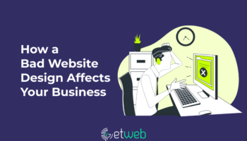
Not only does a website serve as the virtual forefront of a business, but it is also often the first point of contact, which sets the first impression...
Is WordPress good for business websites? For startups and SMEs, WordPress is more than good where you can easily make changes yourself without having to involve developers. WordPress...
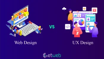
When you’re designing a digital product like a website, you will have to make the best of both web design and UX/UI design. But what’s the difference between...
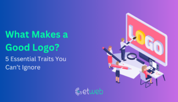
Logos are everywhere around us. From the iconic golden arches of McDonald's to the swoosh of Nike, logos are symbols that represent companies, brands, and even ideas. But...
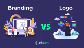
Branding is all about creating a distinct identity, image, and reputation for your company in the minds of your target audience, prospects, and customers. It’s a broad idea...
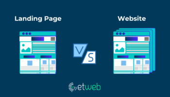
When starting out with establishing your business’s online presence, you might hear terms like "landing page" and "website" thrown around. To put it simply, a website is a...
Let us know how we can help!
We are eager to listen to killer ideas or your needs for a digital solution! Drop us a text and we will reply within a business day

 Let's Talk
Close
Let's Talk
Close


No Comments